- Li's Newsletter
- Posts
- 🧂I tested 6 AI website builders so you don't have to
🧂I tested 6 AI website builders so you don't have to
The honest guide to technical founders need in 2025
Li Zeng
September 19, 2025
After using 6 AI tools to generate test websites for the same business, I've compiled my assessment as a designer who has worked on 100+ websites.
This guide cuts through the marketing hype to show you what actually works and where these tools still fall short. I have also posted this on X if you want to see my original post: https://x.com/lizengco/status/1914809080461578336
The Testing Process
To ensure a fair comparison, I used the exact same prompt for all tools, when some tools struggled coming up with content, I used copy from Lovable which is the universal copy prompt I give to all tools.
My Prompt:
Create a Tech & Digital website for Portfolio named "Ryplix Solutions" with a center aligned layout featuring complex header with navigation and detailed footer with multiple sections.
The hero section headline is: "Unlock the power of AI for modern businesses". The typography should be center aligned with more white space around it. The hero section can include brand color as background, creating a 10px white border around the hero section. Make sure the visuals tell the story of the headline.
Implement modern Human Interface design principles. Use the following color palette: primary (#8383FF), secondary (#67E5C3), accent (#FFF9F2), text (#031447), text secondary (#344054).
For typography, use Recoleta for headings and Inter for body text. Include Line Icons for the icon system and illustration style for visual elements. Implement advanced level functionality with support for Responsive Design.
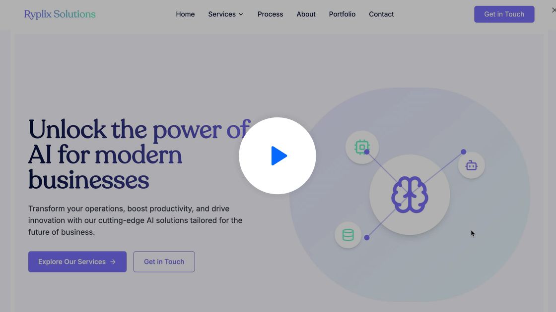
1. Lovable
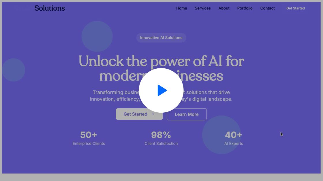
First Impression: Most effective tool for comprehensive copy and structure - so good that I ended up using their copy as the final content.
Strengths:
Excels at creating coherent website sections with logical flow
Typography implementation is spot-on
Strong metrics highlighting modules
Clean hover state transitions
Weaknesses:
Limited hero section visualization capabilities
Missing testimonial sections in some templates
Alignment issues (overuses center alignment for lengthy text)
Generic image selection
Designer's Note: While they handle typography well, they sometimes struggle with text contrast on colored backgrounds. For example, they should use black text on cyan backgrounds rather than white for better legibility.
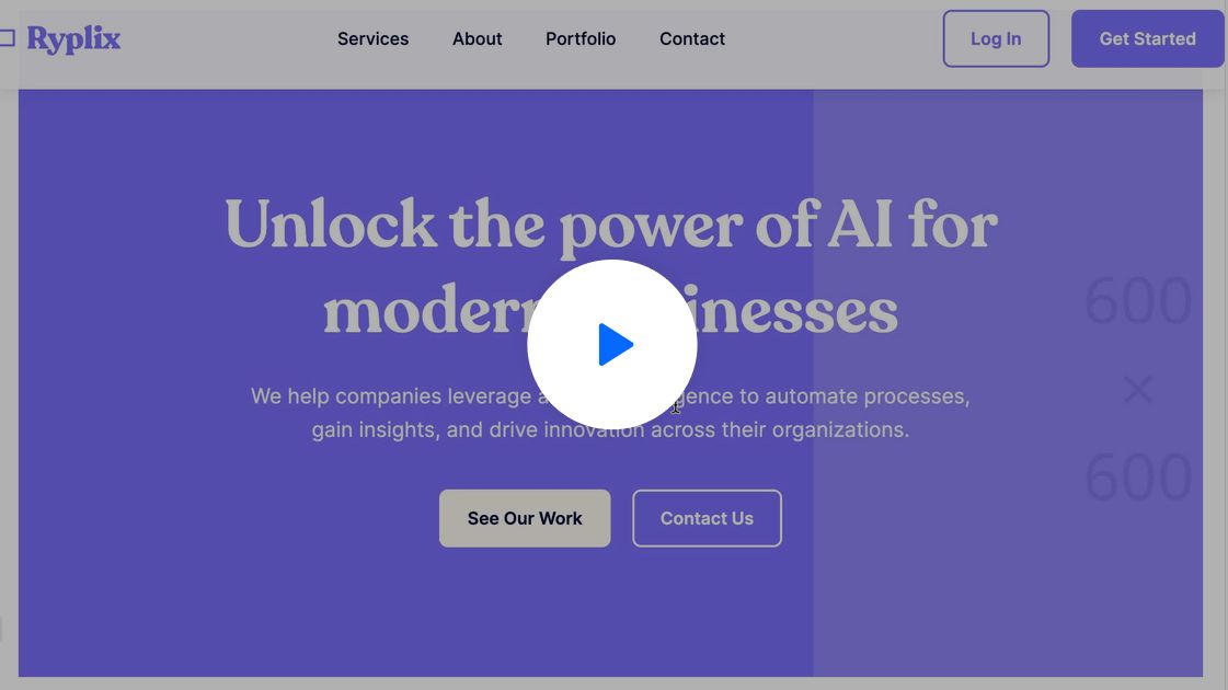
First Impression: Most organized and detailed in terms of structure and interactions.
Strengths:
Thoughtful logo implementation with complementary graphic icon
Excellent navigation with distinct hover states
Strategic CTA color usage that enhances conversion potential
Proper contrast recognition (black text on cyan, white on purple)
Interactive testimonial section with swipe functionality
Weaknesses:
Stock image selection feels dated and too corporate
Hero section visualization lacks creativity
Image height proportions could be improved
Designer's Note: Bolt excels at recognizing color brightness and applying appropriate text colors for maximum legibility - something many other tools missed.
3.Rollout AI
First Impression: My least favorite. Missed basic fundamentals like typography. Blog image selection is inconsistent and visually messy.
Strengths:
Adequate contrast for readability
Weaknesses:
Poor typography choices and hierarchy
Inconsistent, mismatched blog images
Generic, uninspired hero section
Lacks visual cohesion across sections
Designer's Note: Rollout AI struggles with core design principles like typography and consistency—areas where others performed better.
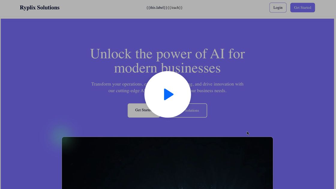
4.Claude
First Impression: Claude knows its weakness with visuals and smartly uses placeholder images instead. Overall structure is solid, but visuals are underwhelming.
Strengths:
Clear layout with well-defined sections
Logical content flow and hierarchy
Consistent spacing and padding throughout
Weaknesses:
Lacks real imagery or compelling visuals
Typography is serviceable but unremarkable
CTA buttons lack visual impact
Feels more like a wireframe than a finished design
Designer's Note: Clause prioritizes structure over aesthetics. The decision to use placeholders is practical, but the site lacks the visual polish needed to feel complete.
5. GPT
First impression: I won't use GPT for website building. It's too basic and missing too many details.
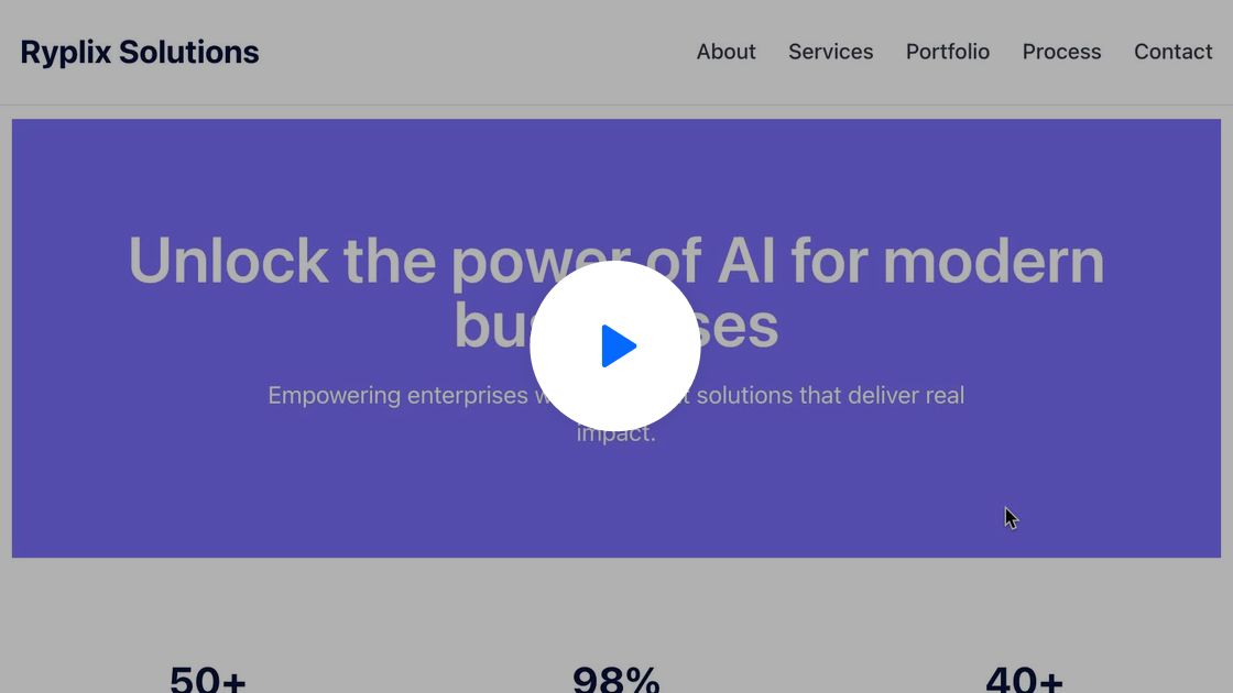
6. Mocha
First impression: I am impressed with the result overall. Mocha stands out as the ONLY one trying to visualize the hero section, though it's basic icons. The subtle treatment on colors and gradient make me believe they actually have good designer who cares about the details of every image.
Overall Assessment
After testing all seven tools, several key patterns emerged:
Content and Structure vs. Visual Design: AI website builders have made impressive strides in generating coherent website copy, logical information architecture, and basic technical implementation. However, they still struggle significantly with visual creativity, unique brand expression, and creating truly memorable design moments.
What Makes a Website Stand Out in 2025:
Content and Structure Elements (AI Handles Well)
Clear positioning and compelling copy
Intuitive navigation and thoughtful interaction
Logical structure and effective storytelling
Development Elements (AI Handles Adequately)
Fast loading times and performance optimization
Mobile responsiveness and adaptive layouts
Design Elements (AI Still Struggles With)
Typography details and color accessibility
Unique brand personality expression
Visual storytelling and custom graphic creation
The gap between AI-generated websites and professionally designed ones is narrowing in terms of structure and technical implementation.
However, as AI makes "good enough" websites more accessible, the value of exceptional design that helps brands stand out increases exponentially.
The Paradox of Democratized Design
When everyone can create a decent-looking website using AI, standing out becomes both more challenging and more valuable. This parallels what we've seen in other creative industries:
As streaming music became ubiquitous, the value and attendance of live concerts skyrocketed. As Netflix made watching movies at home easier, the premium theater experience (think: reclining seats, dining options) became more desirable for true experiences.
The same pattern is emerging with websites: as generic AI-generated sites proliferate, brands that invest in distinctive, memorable digital experiences will capture disproportionate attention and trust.
Strategic Recommendations for Founders
Based on my extensive testing, here's how founders should approach AI website builders in 2025:
For MVPs and Testing: Use AI tools confidently for early-stage validation, focusing on StructureAI or Lovable for content structure and QuickSite for rapid deployment.
For Growth-Stage Startups: Consider using AI tools as a starting point for copy and content generation, but invest in design customization. Bolt and Lovable provide the best foundation for further customization.
For Scale-Up Brands: Use AI tools for rapid prototyping and iteration on simple sections, but partner with design professionals to elevate key visual touchpoints like hero sections and ensure your digital presence differentiates you from competitors.
The Future of AI Website Design
Looking ahead, we can expect AI website builders to continue improving rapidly, especially in:
Visual customization: Better illustration generation and unique visual treatments
Industry-specific optimization: Templates designed specifically for SaaS, eCommerce, etc.
Content personalization: Dynamic content that adapts to different user segments
However, the fundamental tension between accessibility and uniqueness will remain. As these tools democratize "good" design, the value of "exceptional" design will only increase.
Finding Your Balance
The optimal approach for most founders lies in strategic hybridization: leverage AI for speed and structure while investing human creativity in the visual and experiential elements that truly differentiate your brand.
In 2025, the question isn't whether to use AI website builders—it's how to use them as part of a thoughtful digital strategy that considers both efficiency and differentiation.
Have you tried any AI website builders? What was your experience? Reply to this email and let me know - I'd love to feature reader insights in our next edition.
Studio SaltI run Studio Salt, a fractional design partner that serves early stage startups. | AdvisingI also advise startup founder on their product/design and designers on their career. |
Loving my content so far? I’d appreciate if you can share my newsletter to a friend 🙂